Posted by MAKMU ta
On Friday, February 24, 2012
type='html'>
1 -Nature's Palette

This nearly neutral room stays warm year-round with touches of sunny yellow, watery blue, and grass green. The sedate background is a smart long-term choice since the room can be updated in a snap with just a change in accessories.
2 -Warm and Cool Mix

Creamy yellow is paired with steely blue in this cozy yet sophisticated kitchen. Notice the pleasing rhythm that's created as the eye moves between the yellow upper cabinets and the island? The kitchen would be far less fetching if the cabinetry were a uniform color.
3 - Fresh Take

Red, white, blue...and pink? Sometimes the reward is worth the risk! Avoid creating pleasant but predictable rooms by taking a chance on a wildcard color now and again. Here, red and pink mingle in the accent pillows, and the blue trellis-patterned wallpaper makes an interesting backdrop for the pink headboard.
4 -Soft Spoken

Fresh color doesn't always mean bright color. This living room evokes a warm and welcoming mood with plush, familiar furniture and a subtle -- and surprisingly sophisticated -- palette of grayed pastels. The geometry of the classic white paneling accentuates the curvy shapes and hushed colors of the furnishings.
5 -Accessorize the Bath

Many people don't think of decorating their bathroom beyond a few guest towels. This oversight can result in a white tile cell with a clinical feel. Luckily, a white background pops with virtually any color. This modest little room is transformed into a charming sanctuary with a casual mix of quaint textiles and a romantic gilt mirror.
6 -All Mixed Up

Aqua, orange, lime, and white -- only the most fearless decorator would attempt that scheme. But some color combos look way better than they sound, if applied with a deft touch. Here, all the colors are united in the terrific rug, and the white furniture and simple window shades give the eyes a place to rest.
7 -Draw the Eye
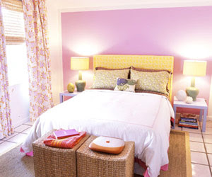
Painting one wall an eye-catching color is a fast and effective way to create a focal point. Here, the sweet fuchsia color could have turned sickly if applied to the whole room. By limiting the violet tint to one wall and contrasting it with the complementary yellow headboard, the bed takes center stage.
8 -It's All in the Accessories

Wouldn't this colorful nook be a happy spot from which to launch your day? Looking closely, the space is really very neutral, with white and beige furniture, and walls that just whisper of yellow. The vignette's outgoing personality stems from the fresh blue, red, pink, and green accents strewn across the surfaces.
9 -Limelight

Imagine this room with exactly the same furniture and accessories -- except the bed frame is stained brown or painted white. Sure, the bedding is still chic and there's the stylish striped bench, but the space would have no oomph, no attitude. Sometimes all a room needs is one bold stroke of color for it to morph from dreary to dramatic.
10 -Fresh and Crisp

The sharp, classic combo of blue and white is a perennial crowd-pleaser. The addition of lemon yellow with twists of lively green gives this charming nook a fresh and modern point of view. The daring mix of color and pattern is grounded by soft walls, a wood floor, and clean white accents.
Posted by MAKMU ta
On Monday, February 13, 2012
Crisp, clean styles common to modern decor can be eye-catching, but it's nice when their colors are inspiring, too. These living rooms are a case in point: Neutral floors and furniture create a simple, modern starting point.

Bold colors can enhance a modern setting.
But instead of leaving these settings in neutral, the designers reached for color. Two rooms feature the sherbet hues pistachio and raspberry, while the third uses the paint-box primaries -- red, yellow, and blue. Cut with creamy white, each looks chic and cheerful. The natural earth tones of wood floors and the tawny shades in the area rugs also lend warmth to these contemporary settings.

In this room, bold color is added to a neutral foundation.
To keep the look in bounds, add neutral accents; to rev up the excitement, use a few well-chosen works of art and decorative accessories in hues you love. Clutter-free contemporary style gives color a high-impact punch.
 Accent pieces without clutter give extra oomph to this room's color scheme.
If your living space has a stunning view, don't hide it. On the next page, find ways to embrace and show off your room with a view.
Posted by MAKMU ta
On Sunday, February 12, 2012
Fearless use of color makes even the most minimal modern-decor kitchen feel lively and inviting. That's because color is an emotionally compelling element in any visual arena.

Bold colors, like this cobalt blue, can make the most modern kitchen warm and inviting.
In each of these kitchens, cobalt blue is used to great effect to bring the room alive.

Bold color can add whimsy to an otherwise stark space.
Choose any bold hue you like. Whether you want a room that's light, airy, and spacious or one that's cozy and intimate, color is a quick and effective way to get the look and feel you want.

Don't shy away from mixing bold colors in your modern kitchen.
European style can contribute to a stunningly sleek and modern kitchen. Find some ideas for a world-class kitchen on the next page.
Posted by MAKMU ta
On Thursday, February 09, 2012
Sherwin Williams sent over this great new tool for me to try out and I am loving it!
Chipit! is an online tool that you can use to match up Sherwin Williams paint colors to any photo on the web. I have been playing around with it on some of my favorite images and it is super fun! You can check out my boards
here and
here!
You can take any image...
and find paint colors based on the palette in the image- I love it!
You can also post it to your facebook, twitter, pinterest, or print it out.
"Now with just the click of a button, any onlineimage can turn into a palette of paint colors, with ChipIt!, an interactive tool from Sherwin-Williams. The first-of-its-kindweb-based tool allows users to select any online image and instantly identify theSherwin-Williams paint colors that correspond to the colors contained withinthe picture. Designers and their clients can now use the colors that inspirethem while surfing the Internet and turn them into paint palettes for anyproject."
"To get started, users create a profile at www.letschipit.com and then add the “Chip It!” bookmarklet to their Internetbrowser toolbar. This bookmarklet allows users to identify up to tenSherwin-Williams paint colors represented in online photos simply by scrollingover the image. From there, users can add the photo and corresponding color paletteto their Chip It! profile, save it, share the creation socially orprint it out."
images via pinterest and chipit

Posted by MAKMU ta
On Sunday, February 05, 2012
In this house you feel alive and this is especially due to the fact that you have some items that stand out colors and lighting.The bedroom is quite lovely with its white design (white walls and cabinets), contrasts with the paintings of youthful colors.
Posted by MAKMU ta
On Thursday, February 02, 2012
Sometimes a simple piece of art can inspire a million ideas!
This is so vibrant and gorgeous!
Posted by MAKMU ta
On Tuesday, January 31, 2012
Mexican rustic decor is always full of details and bright colors. Solid wood furniture are those who definitely give that character with rustic accessories and coatings.
But not only bright colors or lot may be the only ones to use in these interiors; the neutral tones create a climate somewhat more elegant and calm.
- Walls in vivid colors: Most usual color is yellow corn in shades of ocher, also blue, red, terracotta, green. These shades are common on the walls but also are often used in textile, fabric, upholstery and decorative ones.
- Walls in neutral tones: Otherwise you can ignore vivid colors on walls to delegate to the supplements. And even decorate everything in natural tones and white throwing hand choosing shades of not too bright green, red or brown to complement the whole.
Posted by MAKMU ta
On Sunday, January 29, 2012
If your interior asks for a bit of life, forget the gray and full of intensity home. What they need walls is a bit of joy, that's what we must reign in the decoration and for this there is nothing better than bright colors.
If you dare to risk in the decor, get in your home breathe optimism and energy. It is best to mix colors, but without creating a raucous atmosphere.
Red, orange, green, yellow, violet or blue revitalize get darker areas, providing warmth and energy. The color is a philosophy of life, our favorite color can say a lot about our personality.
The bright colors help brighten every room providing ranges of colors that dare to use, but when you know how to combine may come as a surprise for her beauty. There's nothing like gladden the eye with beautiful contrasts.
Posted by MAKMU ta
On Monday, January 09, 2012
If you are thinking about changing the color of the walls of your home for a bold color, one option is to choose a palette inspired by wine tones that are both warm and cold, here are some tips:
- Choose two shades: Two shades of purple give this room a vibrant feeling and upholstered furniture in neutral tones give balance to this animated wall.
- Relaxing and sophisticated: A soft plum tone is less jarring than some other shades of purple, and suitable for an elegant bedroom. Limited only that to color the walls and try to put all the white linen to give it balance.
- Strong but warm: The red paint gives life to a kitchen and is a choice when combined with sophisticated neutrals and bright appliances stainless steel. Highlight a wall with this intense shade of red or be brave and give it a fresh coat and paint all four walls.
- Strong and comforting: The burgundy-colored walls, combined with dark wood tones, create a warm and enveloping atmosphere.
A patterned carpet and decorative pillows in coordinated tones reinforce the color scheme. The colored sofa stands out among the strong tones and a bit distracting attention from the striking room.
- Along with neutral tones: The purple color of this kitchen walls has a touch of blue in contrast to the warm wood tones.
A shaggy rug under the kitchen table defines the dining area. The white shade roofs are a smart choice for people who worry that the dark paint makes a room look smaller.
- A quiet room: A mauve-gray is a great tone for a bathroom. Details come in shades such as ceiling and feet of the tub, give a pleasant sensation. The trim white, transparent curtains, and silver mirror brighten the space.
- A strong choice: An off-white headboard stands out among the fuchsia tone paint this room. The colorful bedding with floral nuances also introduces more color: bright orange, pink, blue and purple. The unframed paintings above the bed adds a touch of femininity and contemporary.
- Along with the warm wood: This color is inspired by warm tones and intense wine. The unique wooden storage system looks great with the purple. The gray ground is a good complement to this strong tone.
Posted by MAKMU ta
On Monday, January 09, 2012
If you want to paint a room like a pro to give it a new look follow these tips:
1- Remove all the furniture and the greatest one must be covered carefully with plastic to avoid staining of paint. You must also remove the wall hangings such as shelves and even the tops of the current switches and valves and for safety cut the power when performing this task. Finally remove all doors, windows and hinges if removable.
2- Then proceed to prepare the surface to be painted: Check the condition of the walls and ceiling, if the surface is firm and clean you can paint directly.
Otherwise, if it is cracked, you shall remove the material and sanding to smooth the edges. Finally remove the dust from the walls with a brush. If the wall is very porous it is necessary to apply a coat of sealer or binder mixed with a bit of paint to use to serve as a primer or base.
3- Then you will cover everything that you do not want to paint, you will define exactly what should be painting, and use the paper tape specifically for painters.
This tape has the peculiarity of having an adhesive that does not remove the paint and is not sticky. Be covered such as window frames, doors and cabinet if mounted, and so on.
In case you want to paint the walls with two colors you should expect the first color dry and then delineate the tape and paint the second color. The masking tape should ideally remove when wet with painting of the last hand.
4- Prepare the paint: if the paint has a film on top, it must be carefully removed by cutting the edge without letting any fall to the bottom piece.
Then mix the paint well using a circular motion until the paint is homogeneous and get a uniform color.
5- When you get the paint ready, begin to paint: First begin with the ceiling with all hands are needed, if the paint is quality one or two hands will suffice.
The angles and areas closer to the walls are painted with a brush first. To paint the ceiling it is best to use a roller with extendable handle for applying a standstill and not having to climb stairs. The roller is impregnated with paint and it rolls over the surface to spread a thin coat of paint.
6- Then proceed with the walls painted from top to bottom taking wide vertical stripes of two rollers connecting strips with steep passes before re-wet the roller to get a perfect finish.
It is recommend to use painter trays where you can load and drain the roller to better control the amount of paint you apply.
Posted by MAKMU ta
On Monday, January 09, 2012
So I am finally getting there (just a week late) to! This weekend I managed to get some work done, not quite enough, but some and I got some nagging organizational projects out of the way. I mostly just cleaned out a few of my little one's spaces so that they were not overflowing with things and tossed a bunch of stuff.
This kitchen is like an organized person's dream. I love that little touch of color with the rug and the light it is just enough to make it fun.
image via pinterest from here
Posted by MAKMU ta
On Sunday, January 08, 2012
Blue: For both indoor and outdoor environments, blue is complemented perfectly with contemporary materials and modern neutral glass, steel and concrete.Red: Color of passion brings energy, very sensual, ideal for intimate rooms with good lighting.Orange: Noted for the brightness because it contrasts life, which seems to radiate light and happiness. It's a perfect color for living rooms or even outdoor terraces.Yellow: This color perfect for revival relaxing, good for creating serene and calm.Green: green are in fashion to convey a lot of harmony in the environment, and get a wonderful sense of space when it is cold and neutral balanced with gray.Violet: Bold and impressive. The intense tone provides power and warmth to any room.Warm neutral: The type of tone is ultra natural when combined with limpid turquoise creates a discreet but elegant feel on the walls.
Cold neutral: We recommend an ultra sophisticated gray for neutral chic brightness environments. Despite being cold, the key will be combined with the furniture. This is widely used in kitchens.
Posted by MAKMU ta
On Sunday, January 08, 2012
Red speaks the passion while white provides calm, and balance between the two gives us a very desirable environments.
Let's see how to join the two colors for beautiful rooms, lively and above all very comfortable.
Posted by MAKMU ta
On Saturday, December 31, 2011
Pastel colors can be very light and soft, and combined with other shades can make great decorative effects.
If you want a nice and soft decor, then it is best to combine several shades of the same color along with the presence of the target (for example, on the roofs). A soft romantic lighting greatly help to our intention.
But if we bring some dynamism to the environment, always in soft tones, we can combine colors that do not "collide" to each other (yellow and lavender, pink and moss green stick and etc.).
Another great option is to provide more intense splashes of color in the environment, thus providing a note of freshness and visual interest. The decoration of walls with baseboards also lends itself to this kind of combinations.
Of course, keep in mind that the pastels are always a perfect solution for children's bedrooms as they create a visually relaxing atmosphere that invites relaxation and tranquility.
Posted by MAKMU ta
On Saturday, December 31, 2011
After years of painting our colored walls, finally white floors became classic. I love them, they are luminous, seem larger and more uniform appearance allows many combinations of materials and colors in the furnishings.
If you are thinking how you want to paint your house, let us suggest some of the many shades of white to paint.
White tone may sound a little monotonous, and if so, instead of painting an entire room of another color, you can choose to paint only one wall.
The wooden floors are perfect with white walls, especially if newly painted.
To paint the floor, if you want to do it yourself, I recommend using a top quality paint, leaving more expensive.
And painting color house is always leaves white roofs, the feeling of space is far greater.
Posted by MAKMU ta
On Saturday, December 17, 2011
Here we present a nice interior living rooms with lots of color; designers are top notch.


