


Note: this post was deleted in the craziness of blogger shutting down, so all comments are gone from the post, too. Luckily I have them saved in my email inbox though! (:
********
Today I'm starting something I'm pretty excited about. Almost daily I get emails from readers and blog friends, wondering how they should solve their latest design dilemma. I so look forward to these emails and am flattered y'all are choosing to ask me! Giving design advice thrills me {probably why I'm major in interior design!} So with that being said, I'm going to start a new blog segment that you'll see poppin' up every now and again.
This is your chance to comment below asking me anything you'd like to know about design. Whether it be a general interior design question, or a specific one relating to your space...I want to help! Next week I'll be answering a few of those questions here on the blog, so come on back and see if your question was answered. Of course you can still email me privately, but if you want your question answered live on the blog, I'd love that, too! You may have the same questions or dilemma as another one of your blog friends. Learning from other people's spaces is always fun and getting a fresh perspective from a new set of eyes is sometimes all you need!
For those of you who are looking for more extensive help, online design packages are coming your way in June! {Lots of fun details on that coming soon(: }
Today I'm addressing a question from my girl Megan over at Mackey Madness. She wants to know how to choose and implement color without the space looking like a circus. I love how she puts this, because to be honest, I've seen a few houses in my day look like that's where they're headed.
1. Game Plan. Pick a general color scheme by deciding on one focal color and one or two accent colors. Always good to choose the inspiration piece first and draw from that for color, instead of matching inspiration pieces to paint colors already applied to the wall.
We did this with our bathroom remodel. Here's our inspiration piece...the wall color is directly from the the gold/beige in the painting:

2. Less is more. You may think applying 3 different colors on each wall in your dining room will be fun, but it may cause your guests to want to...you know what...while eating.
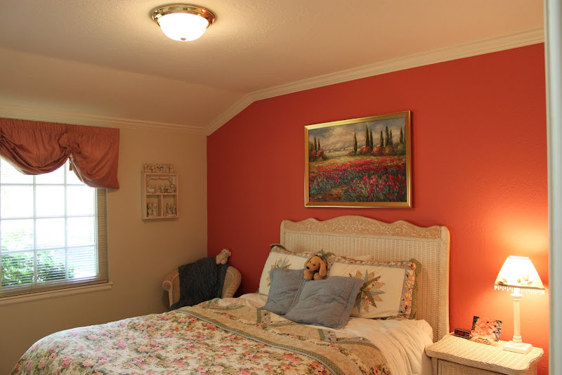
Focal walls are nice ways to implement color, but not too much. Paint {or wallpaper} one wall to make a statement and add pops of that same color elsewhere in the room. 3 neutral walls with one colored wall is fun, too. I recently did this with our guest room, simply pulling out the tangerine color:
3. Think outside the box. You don't just have to implement color with paint! Choose a mellow color for the walls and go with a bold rug, drapes or pillows.
Kirsten does it perfectly in her living room and office:


4. Make sure your colors "go". Here is a general list of colors that tend to work together:
Blues and greens, blues and oranges {complimentary colors!}, purples and pinks and turquoise, yellow and turquoise, beige and just about anything, red and blue, pink and green, purple and yellow {complimentary again!} and white white white {obsessed}.
Rule of thumb: If the colors are found in a fabric together, they most likely work together. Again, always draw from existing pieces you love.
5. Before you leave the house, take one piece away. Didn't Coco Chanel say that about jewelry? I think so. Same is true with color in a room...if you're worried about it being too much, just remove an item with color.
Black and white objects anchor a room. Make sure there's a touch of neutral in every room.
Hope that helps, Meg!
1. Game Plan. Pick a general color scheme by deciding on one focal color and one or two accent colors. Always good to choose the inspiration piece first and draw from that for color, instead of matching inspiration pieces to paint colors already applied to the wall.
We did this with our bathroom remodel. Here's our inspiration piece...the wall color is directly from the the gold/beige in the painting:

2. Less is more. You may think applying 3 different colors on each wall in your dining room will be fun, but it may cause your guests to want to...you know what...while eating.
Focal walls are nice ways to implement color, but not too much. Paint {or wallpaper} one wall to make a statement and add pops of that same color elsewhere in the room. 3 neutral walls with one colored wall is fun, too. I recently did this with our guest room, simply pulling out the tangerine color:

3. Think outside the box. You don't just have to implement color with paint! Choose a mellow color for the walls and go with a bold rug, drapes or pillows.
Kirsten does it perfectly in her living room and office:


4. Make sure your colors "go". Here is a general list of colors that tend to work together:
Blues and greens, blues and oranges {complimentary colors!}, purples and pinks and turquoise, yellow and turquoise, beige and just about anything, red and blue, pink and green, purple and yellow {complimentary again!} and white white white {obsessed}.
Rule of thumb: If the colors are found in a fabric together, they most likely work together. Again, always draw from existing pieces you love.
5. Before you leave the house, take one piece away. Didn't Coco Chanel say that about jewelry? I think so. Same is true with color in a room...if you're worried about it being too much, just remove an item with color.
Black and white objects anchor a room. Make sure there's a touch of neutral in every room.
Hope that helps, Meg!
So, bring it on ladies! What's your design dilemma?
Ready. Set. Go.
Love,


0 comments:
Post a Comment